In this current post, I return to the discussion of the Business Model of All of Higher Education. In a previous post, The Business Model of All of Higher Education Is Broken, I introduced the five sources of revenue for Institutions of Higher Educations(IHEs): 1) Tuition and fees; 2) Fundraising, advancement and development efforts; 3) Endowment income, appreciation, interest and dividends; 4) Auxiliary enterprises; and 5) Governmental appropriations. In this post, I had originally planned to consider all of those sources of revenue in one post. However as I began to work with that idea, I found the explanations growing too large for one post. In addition, no matter how hard I cranked the revenue generating machine for each revenue source in an attempt to create additional funds, I discovered that increasing the effort in any given area did not produce a commensurate return on investment (ROI). Therefore, I decided that I needed to expend more time and coverage in this series to each source of revenue to give it the analysis I felt it deserved. Thus, I have decided that I will begin to plan to cover each of the revenue sources individually in separate posts. As I get into the ins and outs of the revenue source, I may have to add more posts. I begin this process with the source of revenue with which all students and their families are most familiar, Tuition and Fees . It is also the revenue source that the general public most clearly associates with Institutions of Higher Education (IHEs).

The revenue from tuition and fees obviously depends upon enrollment. This means that there are really only five ways to increase the useable revenue from tuition and fee. These five possibilities are:
- increase the tuition and fees, thus increasing the base amount each student pays;
- increase the number of students paying the tuition and fees, i.e, increase tuition-paying enrollment;
- decrease the discount rate on tuition, thus decreasing the average amount of institutional financial aid given to enrolled students;
- change the model of teaching and learning in order to increase the efficiency of the use of this revenue stream;
- do a combination of two or more of the above at the same time.
With points 3 and 4 above, I apologize for sneaking the expenditure side of the business model into the conversation. However, much of the general public acts as if it believes that tuition and fees cover the cost of a college education. This is definitely not the case, and has not been the case since the beginning of formal American higher education in the mid-17th century. Since this rabbit trail would take us deep into the expense side of the budgets of IHEs, I will leave the exploration of this topic to another post. I will devote the remainder of this post to just addressing the issue of increasing tuition and fees. I will cover the problems of increasing the number of students, decreasing the discount rate and changing the model of teaching and learning in additional posts. I will also address the four other IHE revenue sources in additional posts.

When IHEs announce tuition increases each spring for the following fall, it is usually met with varying degrees of disdain. Students, parents, the general public, as well as federal and state governments are already enraged at the current level of tuition and fees. The data are clear. Tuition and fees have increased at rates exceeding the annual general inflation rate for years. Just at the suggestion of another increase, the reaction varies. It runs the gamut from a reluctant acceptance to a loud murmur to a campus uproar and rebellion.
The following three charts use the same data extracted from the College Board Pricing Trends, which has the most comprehensive collection of data on college pricing trends. Although the charts are based on the same data, they give us three different pictures of the history of Tuition and Fee Increases over the past 40 years. Why have I chosen to present this information in three ways? It is to try to help my readers understand that there are different ways to look at the same data and that one’s first impression may not be the only or best way to view the subject.
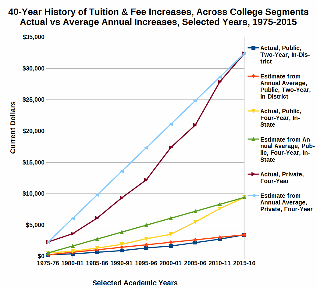
The first chart is a 40-year history of tuition and fee increases in “current dollars,” i.e, the average list price of tuition and fees for all colleges in a given segment weighted by full-time undergraduate enrollment. These list prices are compared against the 40-year average increase in list prices. The current dollar tuition and fees are the prices that students, their parents, and government officials will see first. These are the dollar figures against which everyone reacts. The first impression from the graph is how similar the tuition and fees were for all three segments in 1975. Based on the scale of this graph, it is almost impossible to distinguish the price of the four-year, public institutions and the two-year, public institutions. Although the private, four-year institutions were more expensive, on the scale of this graph, in 1975 they did not appear “that much more expensive.”

The second impression that this graph conveys to me relates to how the actual increases fall below the projected increases based upon the 40-year average annual increase. This means that the early increases were less than the average annual increases and it took quite awhile for the actual increases to catch up with the average annual increases. It appears that the sharp increases in both public and private four-year schools occurred in the period from 2000 to 2010. This would coincide with decreased support from government appropriations for financial aid.
This graph clearly gives the impression that the gap between the three segments has grown significantly. This is the feeling that students and their parents get when they start looking at colleges and the tuition prices. The fourth and fifth impressions that this graph gives me revolve around the two-year public institutions. The first of these impressions is how much more affordable this choice seems compared to the other two choices. The second impression is how close to a straight line the actual increases appear. To me, and many other commentators and critics of higher education, this raises the spectre of whether these institutions “know the secret” for holding down tuition increases.
The two primary conclusions that many will draw from this graph are: 1) the two-year, public institutions are the most affordable choice for an education; and 2) the four-year, private institutions have had uncontrollable tuition increases over the past 40 years.
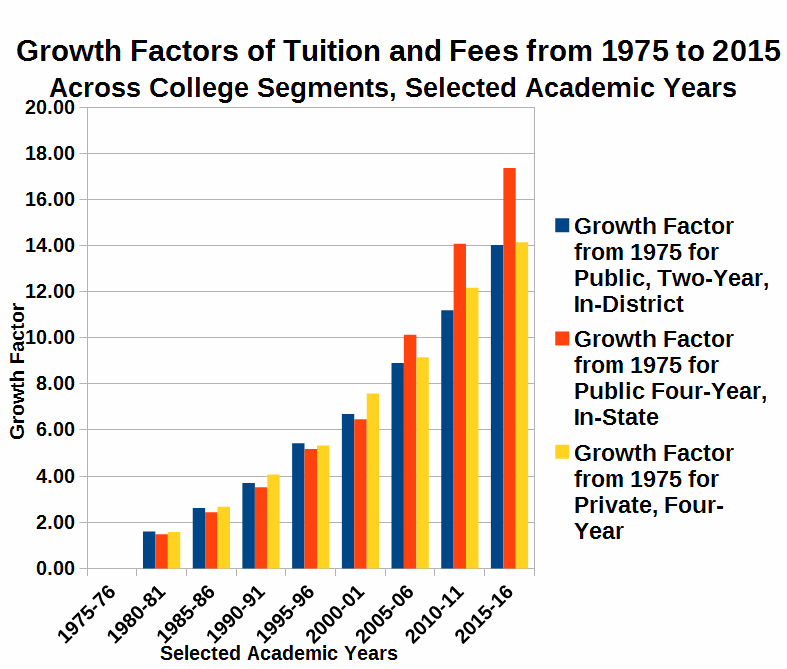
The second graph, entitled Growth Factors of Tuition and Fees from 1975 to 2015 Across College Segments, Selected Academic Years, portrays the same data that the first graph did, but gives a very different slant to that data. This chart tells us how fast tuition and fees grew. Surprisingly, it says that the time to double has been relatively constant. In rough terms throughout the 40 years from 1975 to 2015, it has generally taken 15 years for tuition in any of the college segments to double.

SInce the blue bars representing the public, two-year institutions increase in height the most consistently, this is another verification of the steady, almost constant rate of growth of tuition and fees for the colleges in this segment. During the first 20 years, I find it very interesting to note that the public, two-year institutions increased their tuition and fees at the fastest rate, while public, four-year institutions at the slowest rate. In the second half of the 40-year period, the growth rate of public and private four-year institutions shot up, far out stripping the two-year public institutions. Does this represent a shift in public funding priorities for higher education?
Although the growth factors were very close since the private four-year institutions started out with higher tuition and fees, doubling the higher rate increased the differential. Thus, the actual dollar spread in tuition did indeed produce growth.Two different graphs give you two different pictures.
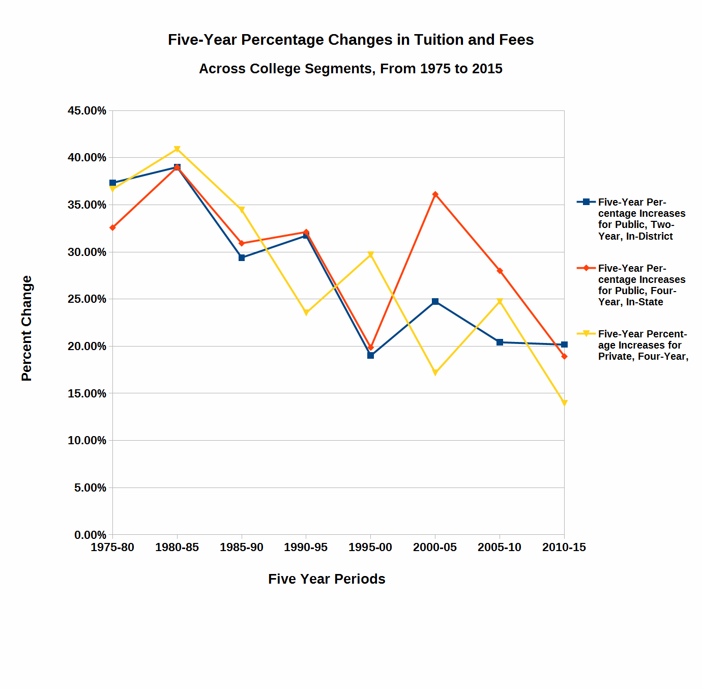
The third graph is entitled the Five-Year Percentage Changes in Tuition and Fees Across College Segments, From 1975 to 2015. This graph plots the percentage change in tuition and fees over five-year periods from 1975 to 2015. This graph gives one a very different picture of tuition and fee increases over these 40 years. The overall trend of data points in this graph are actually decreasing. This doesn’t say that tuition and fees are decreasing. What it says is that the rate of change is slowing.

Looking at the three different sets of points and lines joining those points, it is not surprising that the blue points representing the two-year, public institutions show the least variation. That confirms what we have seen in the other two graphs. The red points show the most variation away from a straight, decreasing line. The four-year, public institutions have been the institutions most affected by the whims of state legislatures or governors. Again, even though the rate of increase for private, four-year institutions is slowing down, don’t look for the public, four-year institutions to catch them in list price anytime in the near future.
Chart 1 hit me right between the eyes. To those who can remember, I challenge you to go back to your college days and put your tuition and fees into an appropriate year in the chart. For some of us we will have to add lines at the beginning of the chart. My experience would extend the chart another 10 years to the left. In the early sixties at the flagship university in a small state, I never paid more than $175.00 annual tuition plus $10 lab fees per science course, which usually added $20 or $30 per semester. Since computers were just coming into use, as a mathematics and physics major I had to pay a $25 per semester technology fee for the right to put my card decks in the hopper each night and come back the next morning to get the print out from the pin-fed line printer. In addition, as a commuter, I had to pay $50 per semester for a “hunting license” to try to find a parking space in an on-campus parking lot. Thus, my total annual tuition and fees bills were less than $550. My textbooks and supplies were less than $150 per semester. I lived at home, and my mother never charged me anything for room and board, because I took care of everything around the house since my father died during my freshmen year in college. Gasoline averaged about $0.30 per gallon, and I spent maybe $10.00 per week to keep my car in gas, and $25 per week for coffee and lunches. Thus, my total out-of-pocket expenses to go to college were less than $2000 per year, or $8000 for my entire undergraduate education. If you subtract the $6000 in scholarships that I won or was awarded, my B.S. degree in mathematics cost me less than $2000 out of pocket. Even in early 1960 dollars, that was entirely possible to pay for out of summer or part-time school year earnings. For my four years in graduate school, I had a fellowship that paid tuition and living expenses. I didn’t pay one nickel out of pocket for my Ph.D. I graduated in eight years of schooling, with a B.S. and a Ph.D.in mathematics, with a wife, a child, a house, two cars, money in the bank, NO DEBT, and an offer of a tenure track job! In today’s world that would be definitely an anomaly. According to CNN, for the most recent year for which data is available, the undergraduates of the class of 2013 walked off the commencement stage with an average debt of $35,200, while Ph.D. graduates “stumbled” off the platform with an average debt of $57,600. Among Ph.D.s, more than 28% had debts of more than $100,000. The average J.D. and M.D. graduating from Law School and Medical School respectively, had a debt of more than $140,000. Much has been written and debated about the debt bubble that has overtaken or is overtaking American higher education. It looks like I have created at least one more blog post on the Debt Bubble.

Why does this picture look so bleak? I believe it looks bleak because we could be on the verge of very bleak times for higher education. American higher education is heading for a perfect storm, unless it changes course or one or more components of the storm change direction. A perfect storm is the confluence of events which individually may not necessarily be dangerous, but the combination of these events creates a potentially disastrous situation. Here, too, I am taking you to the suspenseful edge, and leaving you to dangle. The perfect storm will be another post in this series on the broken business model of American Higher Education.
Leave a Reply